Empowering Users with Actionable Data: A Dashboard Use Case Study
In today’s data–driven world, it’s crucial to empower users with dashboards that transform complex information into clear, actionable insights. This case study explores how we designed an intuitive dashboard that simplifies data interpretation, streamlines workflows, and enhances decision–making.
My Role: Senior Product Designer
Workshop Facilitation, Visual Design, Data Design
Overview
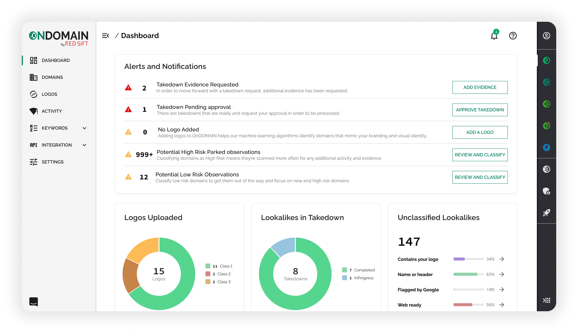
We envisioned a dashboard serving as a central hub for our users—a place where they can immediately identify areas requiring attention and seamlessly navigate to different sections of the product. By highlighting actionable events and critical tasks, the dashboard empowers users to prioritize their activities effectively, ensuring that important issues are promptly addressed.
The Problem
In our product, several areas require user attention, but users may remain unaware of these unless they actively navigate to each section. This lack of visibility can lead to missed tasks and decreased efficiency.
The Solution
To address the challenge of users potentially missing critical updates within various sections of the product, we propose a centralized dashboard that aggregates and highlights key data points from across the platform..
The Result
By offering real-time insights and streamlining task management, users have been effective in prioritizing their responsibilities, leading to better decision-making and increased efficiency. This approach has improved collaboration and ensured critical tasks receive timely attention.
Ideation and Brainstorming
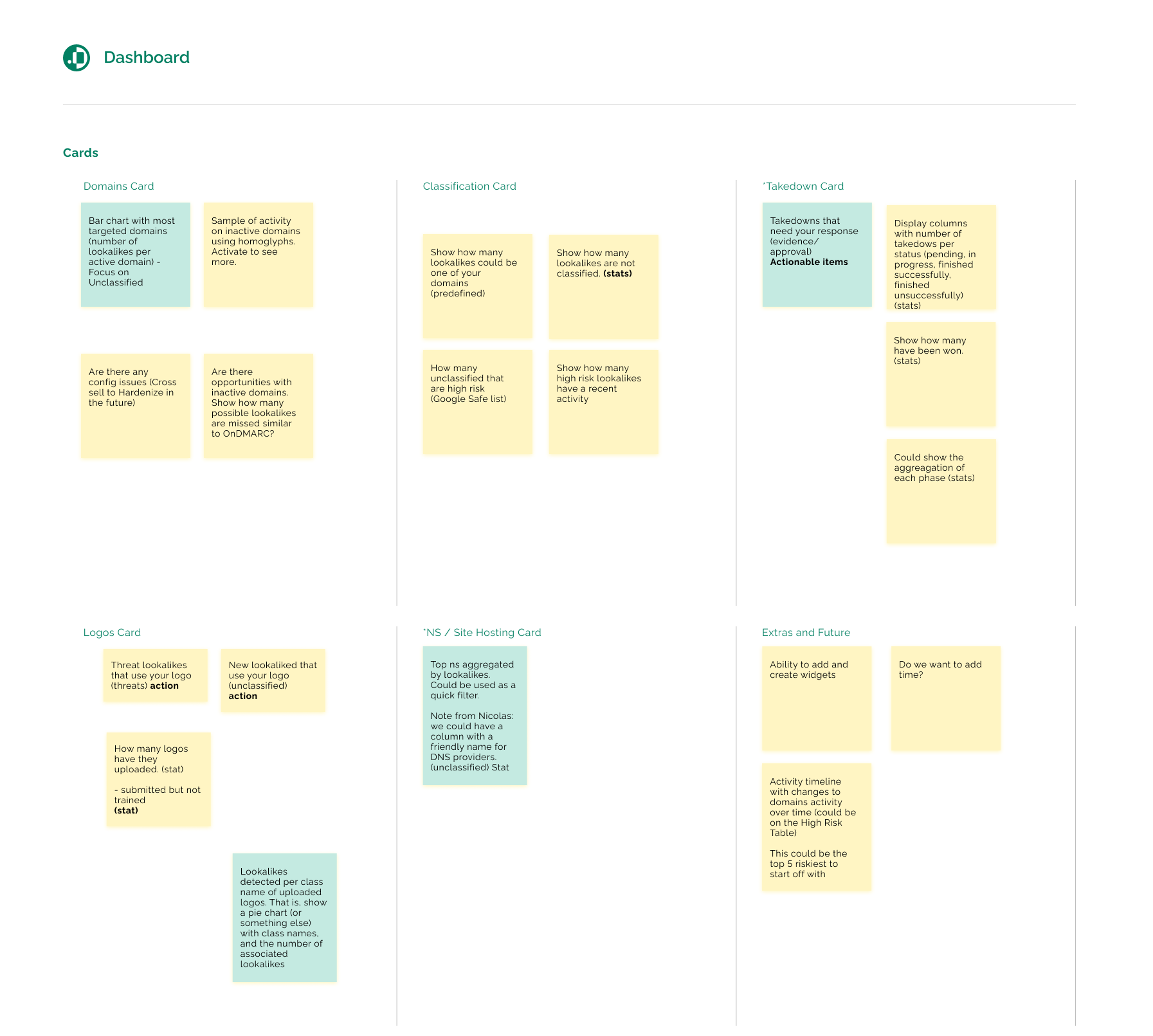
I led a collaborative brainstorming session with key stakeholders to identify and prioritize the critical data points that our users should be aware of. We structured the session into two main focus areas:
-
Product Areas for User Awareness: We pinpointed specific sections of our product that are essential for users to engage with, ensuring they are informed about functionalities and features that can enhance their experience.
-
Key Data Points Driving User Action: We identified the most relevant data elements that would prompt users to delve deeper into specific product areas and take meaningful actions.
This structured approach allowed us to align on the most impactful information to present to users, fostering a more intuitive and action-oriented user experience.
Use Cases
I used the Given-When-Then method because it provides a clear and structured approach to defining test scenarios. It provides a clear and consistent format for specifying the context, action, and expected outcome of a particular behavior or feature.
-
Given: Establishes the initial context or preconditions from the user’s perspective.
-
When: Specifies the action or event initiated by the user.
-
Then: Describes the expected outcome or response that the user should experience.
The main goal
As the account holder, I want to login and see any latent or high level threats as well as any anomalies around my observations, so that I can take the neccessary measures in terms of reporting, or marking the issue and being able to keep a closer eye on it.
Senario 1: How many of my domains are being targeted
Given that I have just logged in, when I land on the dashboard, then I should see my most targeted domains
Senario 2: There are new items under Unclassified
Given that there are new observations or lookalikes, when I land on the dashboard, then I should see the latest observations so that I am able to classify them accordingly.
*Level-0 Goal
Senario 3: Being able to see if there is any actions I need to do on takedowns.
Given that I have takedowns needing my attention, when I land on the dashboard, then I should see any actions required on my takedowns (evidence, approval).
Senario 4 : Seeing top-targeted or most used logos with lookalikes.
Given that I have added logos/classes, when I am on the dashboard, then I should see which classed/logos have been used the most.
Senario 5 : Top NS Providers on lookalikes.
Given that NS providers are used by multiple lookalikes, when I am on the dashboard, then I should see which NS records are most used so that I can easily action lookalikes according to this.
The Design Process
Wireframing and Ideas
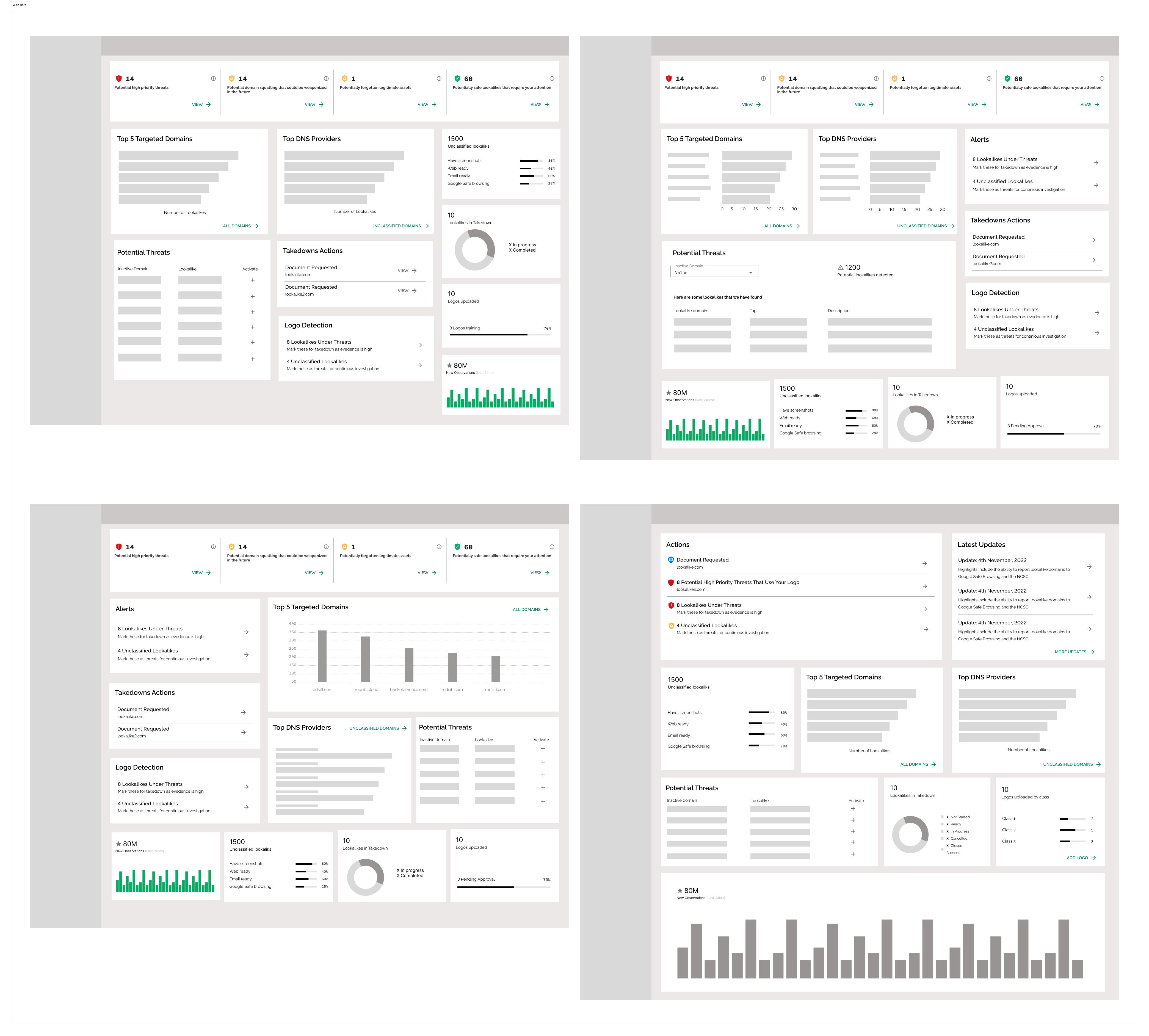
As part of the early design phase, I explored a variety of data visualisation approaches, layout structures, and content hierarchies to determine the most effective way to surface insights at a glance. These sketches reflect my process of iterating through different combinations of dashboard cards, metrics, and visual components, focusing on clarity, accessibility, and usability.
I tested multiple configurations for grouping related data—such as alerts, threats, and DNS activity—while considering how users might scan, prioritise, and act on information quickly. Each variation aimed to balance visual density with digestibility, ensuring the interface could scale with more complex or evolving data.
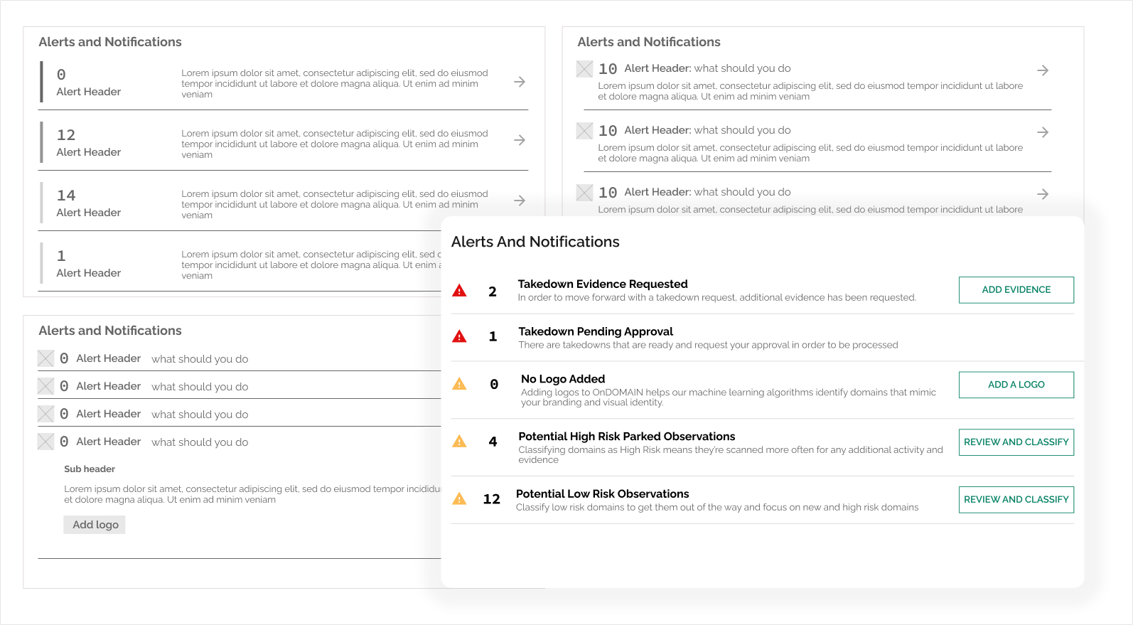
Itterating on the Alerts Card
As part of the dashboard design, we identified alerts as a primary interaction point and made it the focal card. Since users could create custom alerts based on their own saved filters, it was essential that this component surfaced the most relevant, user-defined data at a glance.
This approach allowed users to tailor the dashboard to highlight only what mattered most to them—whether that was a high-risk domain, pending takedown action, or missing information like logos. The card evolved through multiple design iterations, exploring layout hierarchy, iconography, and CTAs (e.g. Add Evidence, Review and Classify) to make next steps clear, immediate, and actionable.
Ultimately, the alerts card became a central driver of user engagement, helping teams triage activity quickly and focus attention where it was most needed.
Final Dashboard Outcome
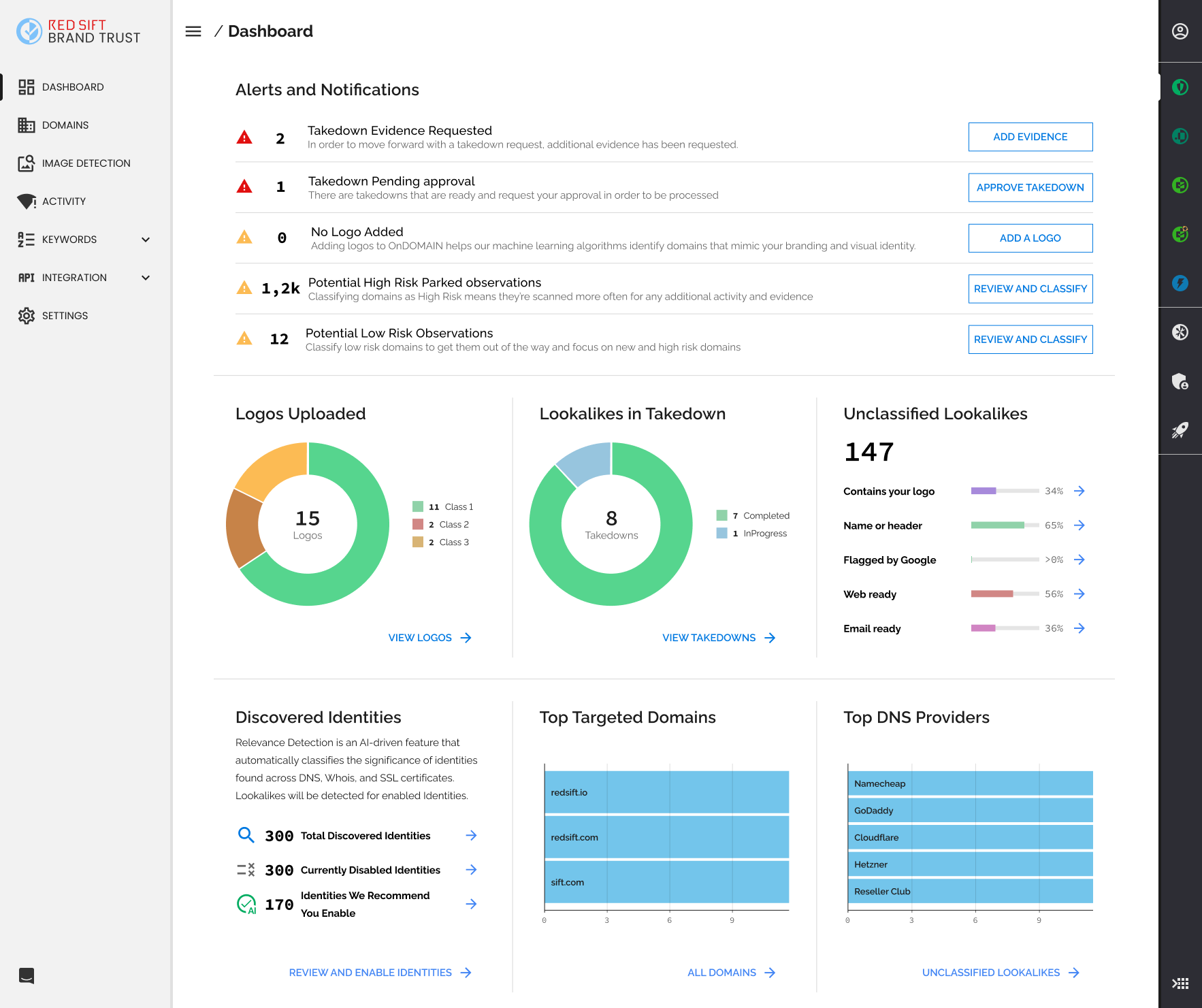
This is the final version of the Brand Trust dashboard, where all the design thinking, exploration, and iteration came together into a clean, data-rich, and user-centric experience.
We placed Alerts and Notifications at the top of the hierarchy, reflecting their critical role in helping users take immediate action. These alerts are personalized based on custom filters, giving users visibility into the risks that matter most to them—whether that’s pending takedowns, missing brand assets, or machine-flagged lookalikes.
The supporting cards surface key metrics in a way that’s quick to digest and easy to act on. Visualizations like the donut charts and bar graphs allow users to track activity across logos, takedowns, and DNS providers at a glance. Meanwhile, the Discovered Identities module highlights our AI-driven detection system, nudging users to take advantage of recommendations.
Throughout the process, I focused on:
-
Prioritizing clarity and usability for security and brand teams
-
Designing for scalability, knowing the data sets would grow significantly
-
Making every card actionable, turning passive data into decision-driving insight
This dashboard was the result of a close collaboration between design, product, and engineering—and it now serves as the central command center for Brand Trust users.
